Dashboard redesign

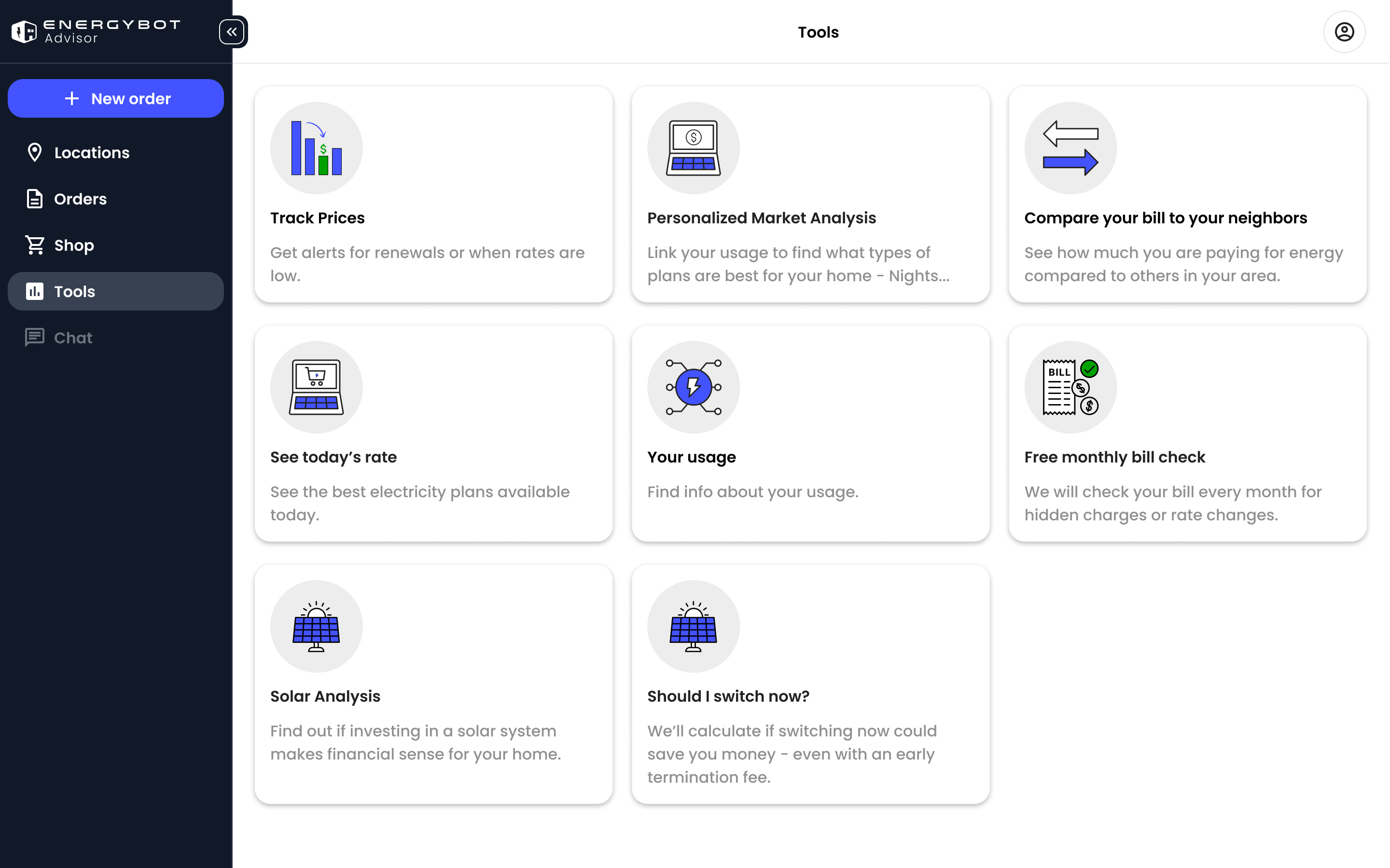
Increased user engagement by simplifying the dashboard experience, encouraging exploration through feature tabs, which led to average session time growing from 20 seconds to 2 minutes and click-through rates more than doubling.

MY ROLE

User Researcher
UX Design
UI Design

DELIVERABLES

User Research
High Fidelity Design
Design System

TEAM

Product Manager
Me (design)
Developers (team of 6)

TIMELINE

8 weeks in a fast-paced startup environment

OVERVIEW

Project goal
Increase user engagement.
The prior version of the dashboard was intended to be experimental. It's goal was to determine if users found value in our tools.
What' the problem?
Tools & features aren't being utilized by the majority of users.
Despite receiving a decent amount of traffic, we hadn't been seeing users engage much with the tools available on our dashboard.

Design System

I prioritized creating a design system to ensure consistency in visuals, interactions, and accessibility across all products. This not only streamlined collaboration between design and development but also sped up delivery, allowing us to scale features more efficiently.

High Fidelity Designs

Prototype

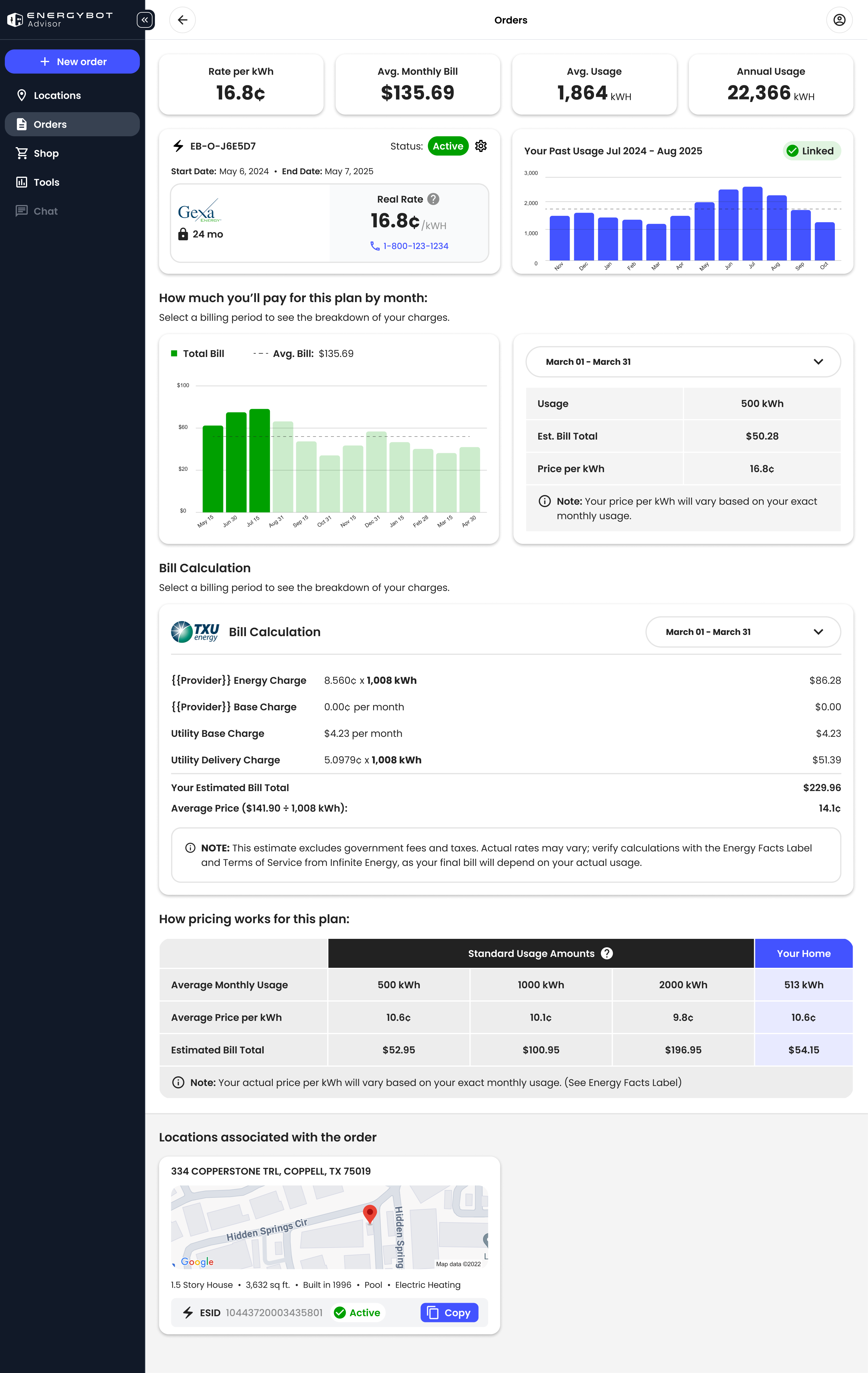
I created high fidelity prototypes of every possible dashboard scenario for both our smallest desktop and mobile screen sizes.