The challenge
EnergyBot is an online platform that helps users shop for electricity plans across deregulated U.S. states. One of the most critical parts of the user journey is the Plans & Pricing page where users compare options and make a final decision. However, the conversion rate was low, only 2%.
The approach
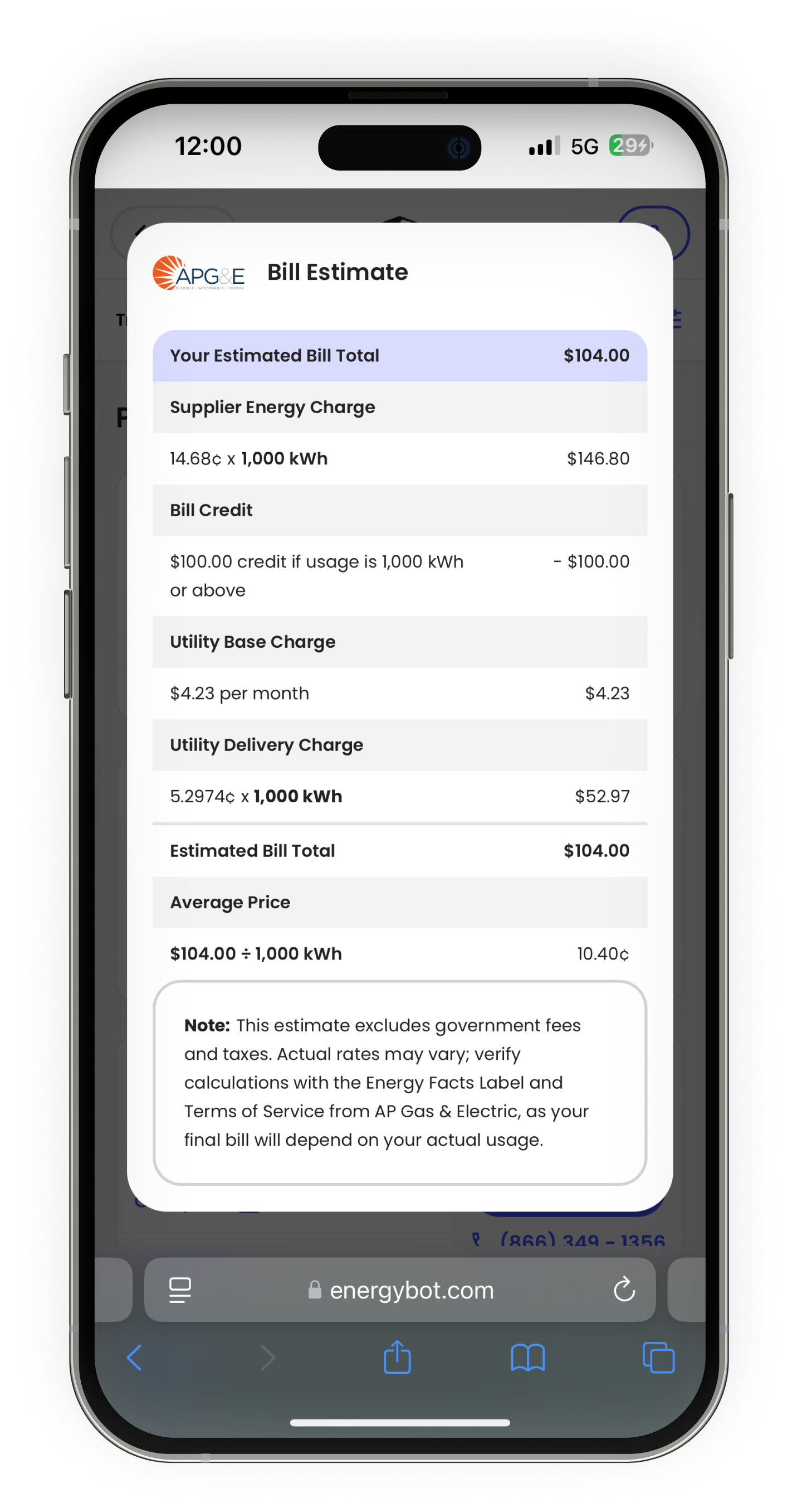
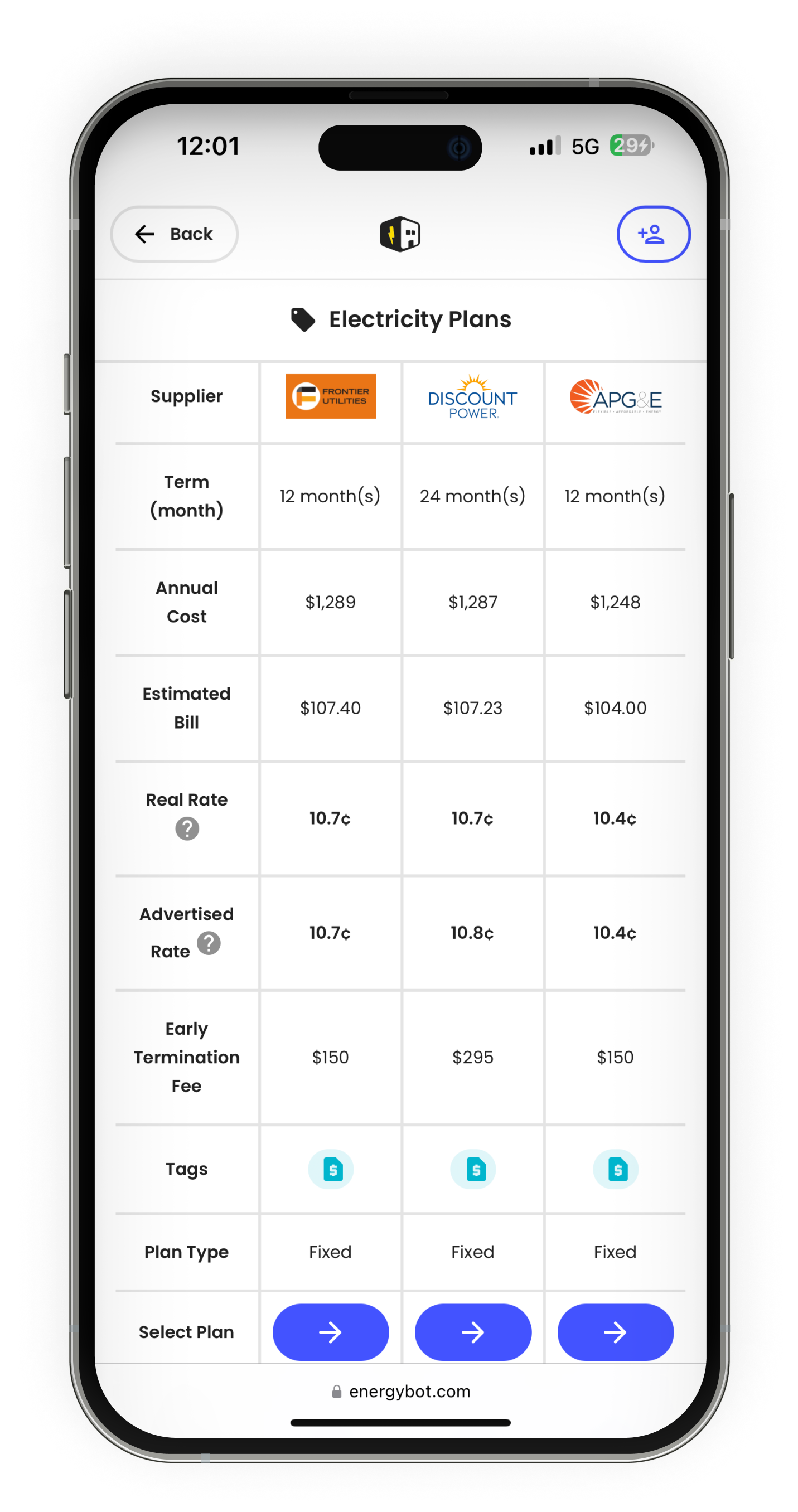
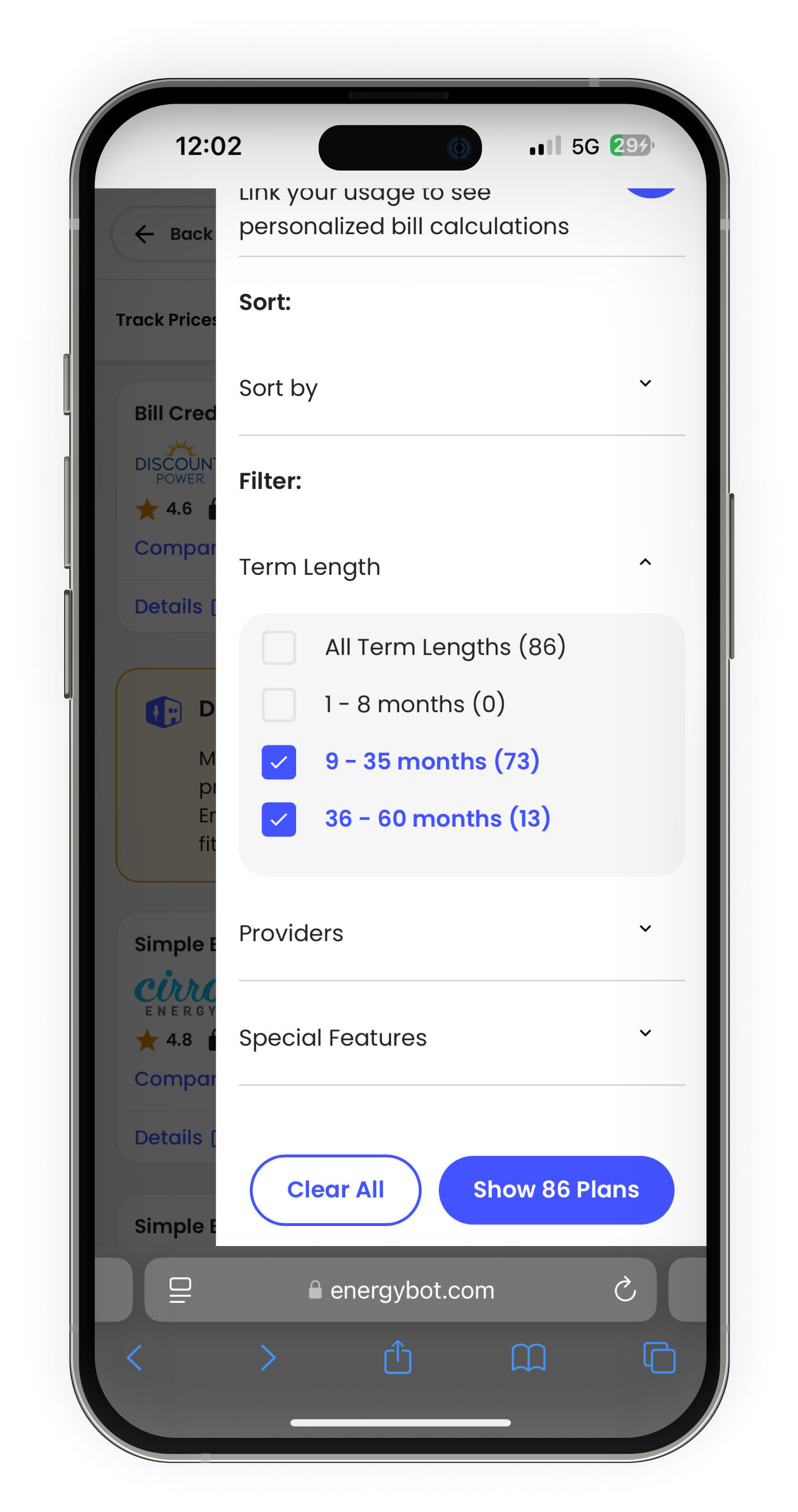
To address this, I led a redesign focused on improving clarity, transparency, and user trust. I started with qualitative research, interviewing both new and returning users who were decision-makers in their households and had previous experience with electricity shopping platforms. Key insights from this research shaped the redesign: users wanted clearer plan details, easier filtering, and a way to compare options without feeling overwhelmed. I created mid- and high-fidelity prototypes, conducted iterative usability testing, and collaborated closely with developers to ensure a smooth handoff.
The outcome
The result was a simplified, user-centered experience that directly addressed the pain points uncovered during research. After launch, conversion rates rose by 300%, and user testing showed increased satisfaction, trust, and confidence in selecting a plan.


